Source note: Originally published on Eric's Advisory Hour Substack. Read the canonical post.
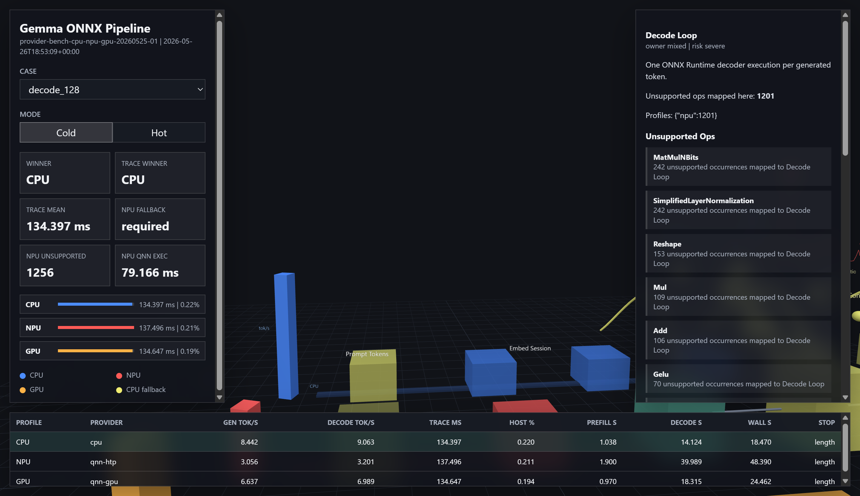
I wrote before how I’m building visualization tools to narrow in where the optimization opportunities are hiding. Over the years I learned that often the place that looks like the obvious place is not the obvious place. The book The Goal covers this in great detail. So how do you find the less obvious place?
Sometimes in pursuit of visuals, you’ll stumble upon the answer.
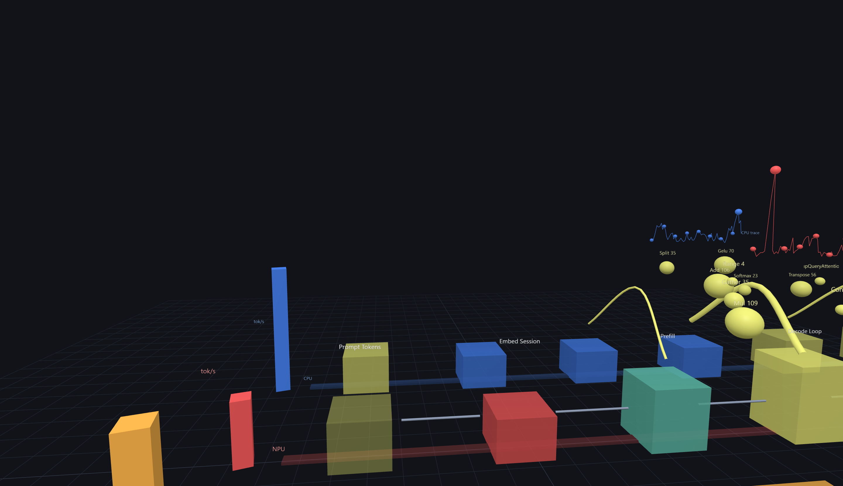
The 3d visualizations are a weird itch of mine that won’t go away. I just really enjoy three-dimensional virtual worlds (see my virtualworld series-ha!). Instead of fighting that itch, I just let it be. There is still a lot of value in standard charts, too. These stats aren’t instructional. It’s what I consider a directional benchmark: is my tooling capturing the benchmarks that likely reveal the problem(s).
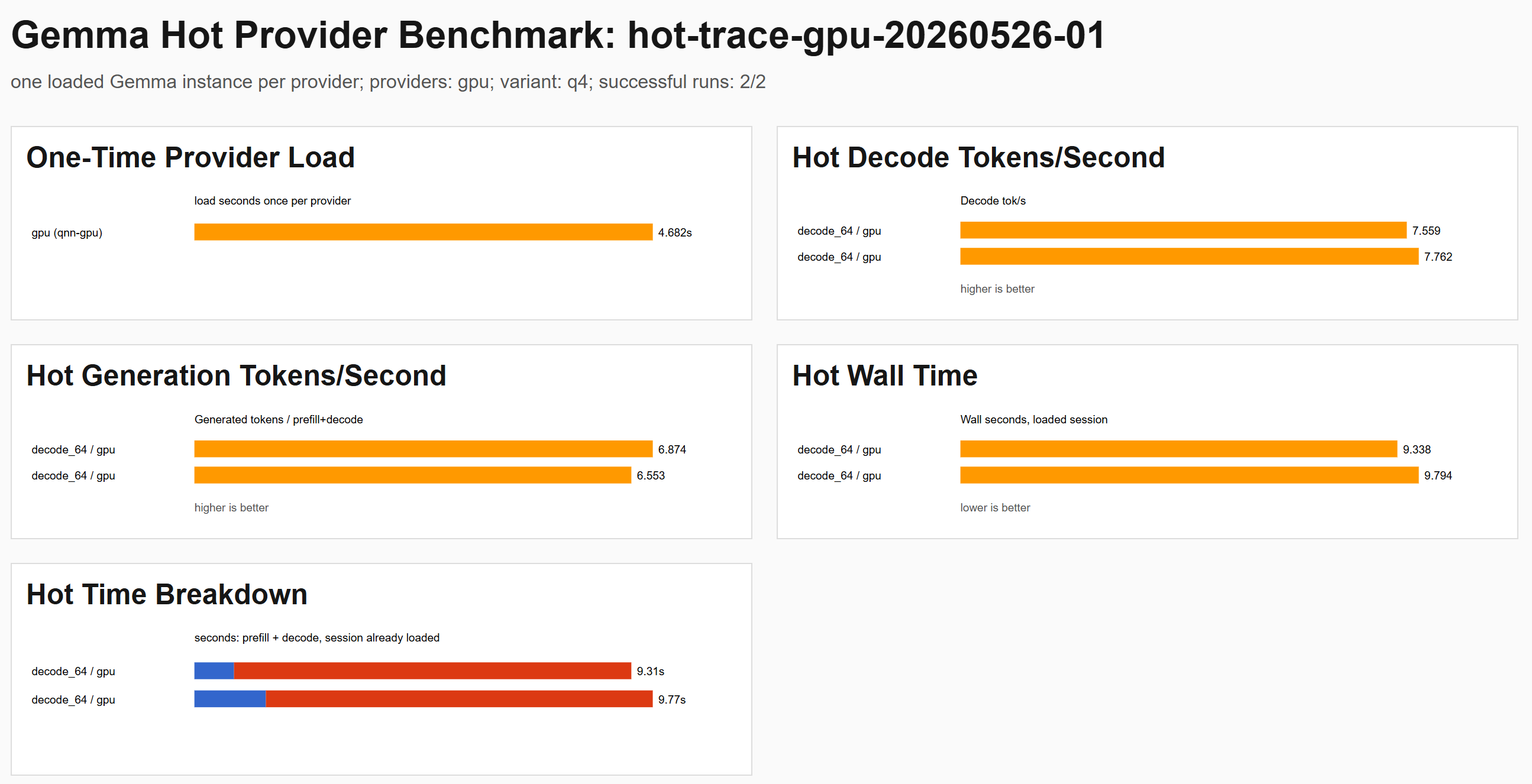
It’s not just the little charts, but also ease of access. Do I have all the data in one place? (Currently, no). Is it easy to navigate? (It’s ok and could be better). Do I see yet the mistakes I’m making? (I have a hunch)
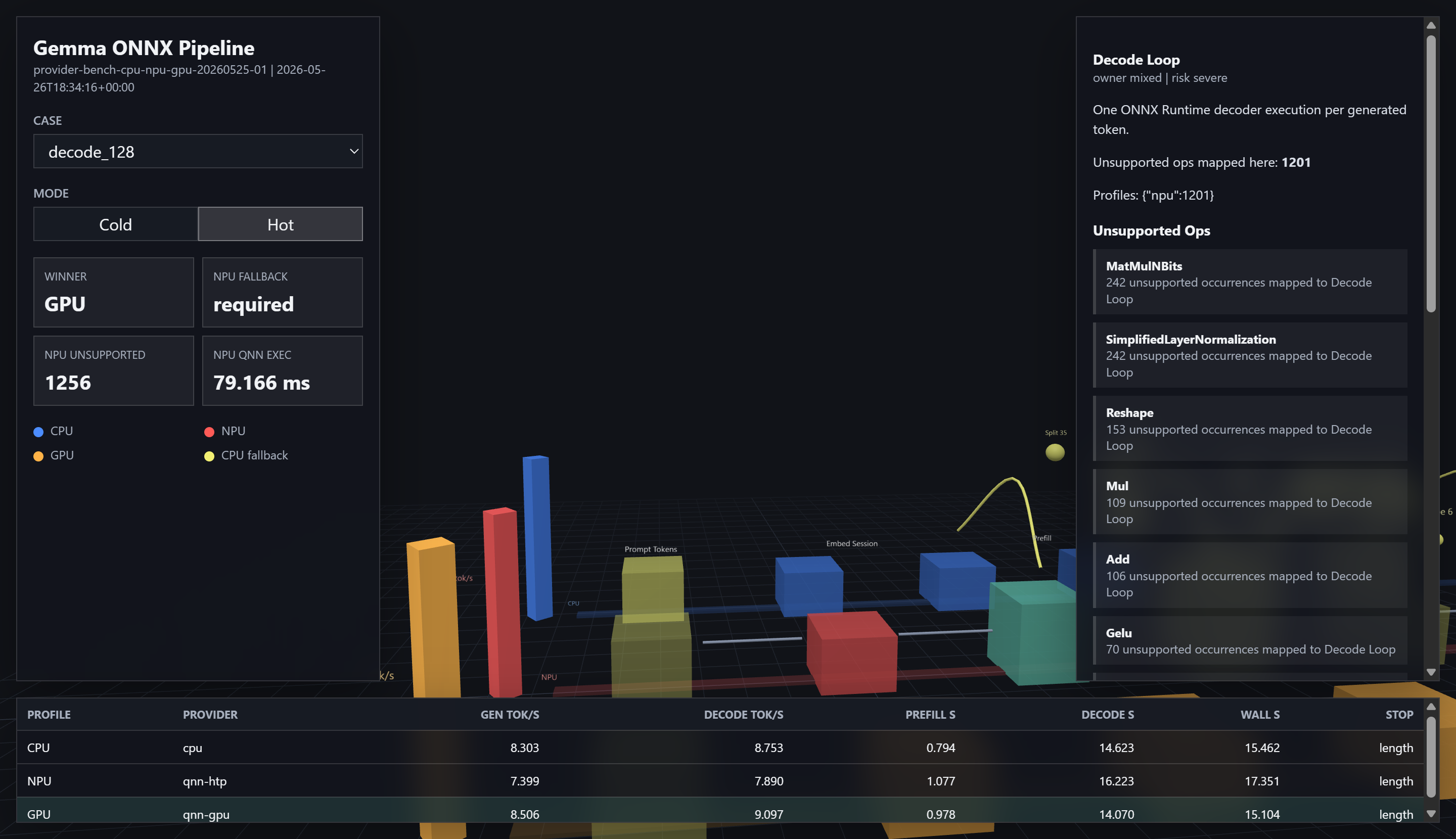
When I say I have theories and a hunch, it’s informed. In fact, I have them articulated in the view. The theories are tested and validated based on the runtime performance.
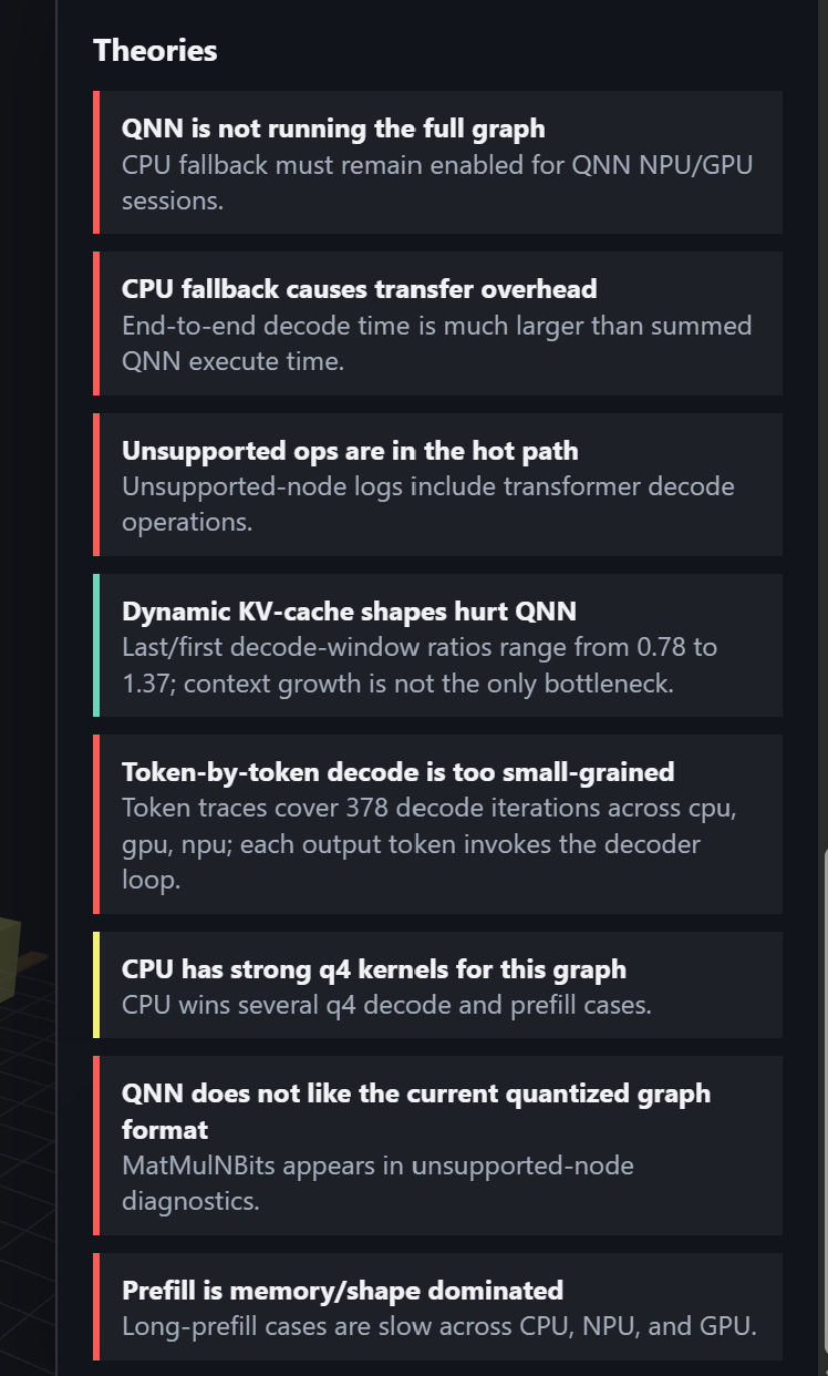
And here’s a tour of just looking over some graphs, in a fly camera in 3d. It’s not quite where I want it, but it’s getting closer. You’ll see how it’s all constructed. The framerate drops are because I’m running a computational batch job in the background plus the recording, but it’s still quite interesting.
I look forward to figuring this out. There’s a kernel of truth to these charts that may have the unlock required to open up the performance delta that should be capable on this hardware.
Original source
This local copy preserves the article text, source link, and inline media. Canonical Substack URL: https://advisoryhour.substack.com/p/onnx-pipeline-visualization-debugging.