🔗 Quick Links
- Live App: crypto-dashboard-ten-green.vercel.app
- Source Code: github.com/JStrait515/crypto-dashboard
- Builder: Jake Strait on Substack
📊 The Dashboard
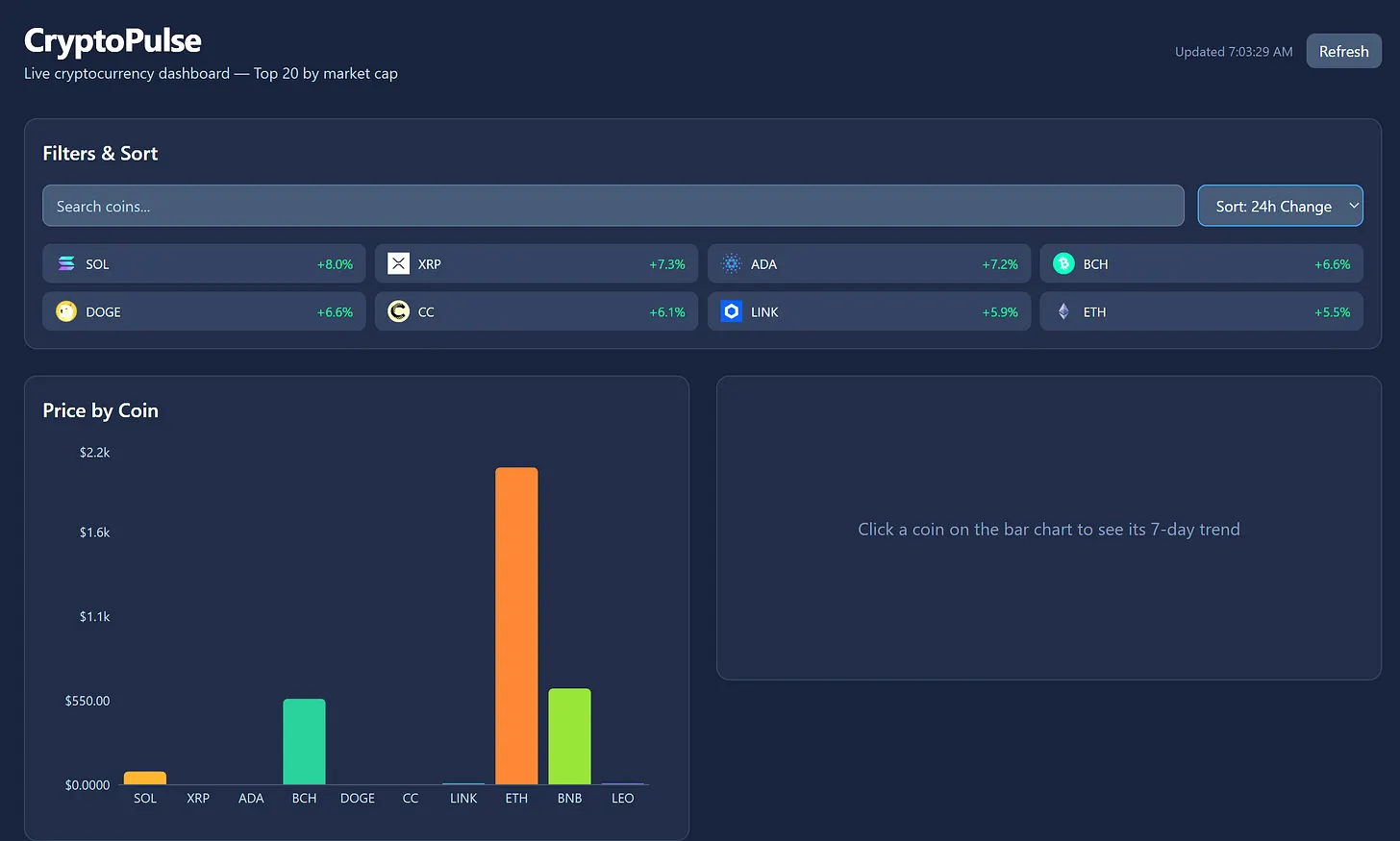
Dark-themed dashboard with live CoinGecko data, interactive charts, and 60-second auto-refresh
🏆 Bonus Points Achieved
Jake makes use of Myles Strait's prior ChartSlice submission in this crypto dashboard — the first competitor to claim the cross-reference bonus. In the spirit of competition, cooperation confers an advantage.
The Builder
Jake Strait brings a fresh perspective to the competition with a focus on live data and real-world utility. While others built static visualizations, Jake connected to live APIs — proving that competition entries can be both functional and immediately useful.
Features
- Price Bar Chart: Top 10 coins by price, click any bar to drill into its trend
- 48h Sparkline: Area chart showing the selected coin's price trend over the last 48 hours
- Market Cap Pie Chart: Donut chart showing market cap distribution across top 10
- Search & Sort: Filter coins by name/symbol, sort by market cap, price, 24h change, or name
- Auto-Refresh: Live data from CoinGecko API, refreshes every 60 seconds
- Dark Theme: Clean dark UI built with Tailwind CSS
Hidden Complexity
There are layers to this dashboard that aren't immediately visible:
- Extended Coin Support: The UI supports a much wider list of coins than initially displayed
- Live Data Feeds: Real-time price updates from CoinGecko — not mock data, not snapshots
- Interactive Drill-Down: Click any bar to see detailed 48-hour trends
- Smart Sorting: Multiple sort dimensions (market cap, price, change percentage, alphabetical)
The Collaboration Meta
What's particularly interesting here is the cross-competitor reference. Jake explicitly builds upon Myles Strait's ChartSlice — not as competition, but as foundation.
"In the spirit of competition we can find cooperation confers an advantage."
This is the first bonus point claimed for cross-competitor collaboration — demonstrating that the Spring into AI competition rewards not just individual excellence, but ecosystem building.
Why Live Data Matters
Most data visualization entries use static or mock data. Jake's dashboard pulls from CoinGecko's live API — meaning the numbers change, the charts update, and the dashboard has real utility beyond the competition.
This represents a different philosophy: ship something useful, not just something demonstrative. The 60-second auto-refresh means this dashboard has ongoing value for anyone tracking crypto prices.
What Makes This Submission Work
- Live Data: Real API integration with CoinGecko
- Multiple Visualizations: Bar charts, sparklines, pie charts — variety of data representation
- Interactive Discovery: Click to drill down, search to filter, sort to compare
- Clean Aesthetic:
- Cross-Reference Bonus: First to leverage another competitor's work
The Lesson
Jake's submission proves that competition doesn't have to be zero-sum. By referencing Myles' ChartSlice and building upon its concepts, Jake demonstrates that the best entries might be those that strengthen the entire ecosystem.
Live data. Real utility. Cross-competitor collaboration. Jake shipped.
🏆 Think You Can Build Something Better?
The competition runs until March 5th. Bonus points available for cross-referencing other submissions, shipping multiple entries, and going beyond the minimum.