Source note: Local copy of a Summer Into AI 2026 submission originally published on Substack. Screenshots, video, and audio found in the post body are mirrored locally when publicly accessible; profile and avatar images are intentionally not copied. Read the canonical post.
Summer into AI Week 3 is about creating punk themed data visualizations from data.gov.
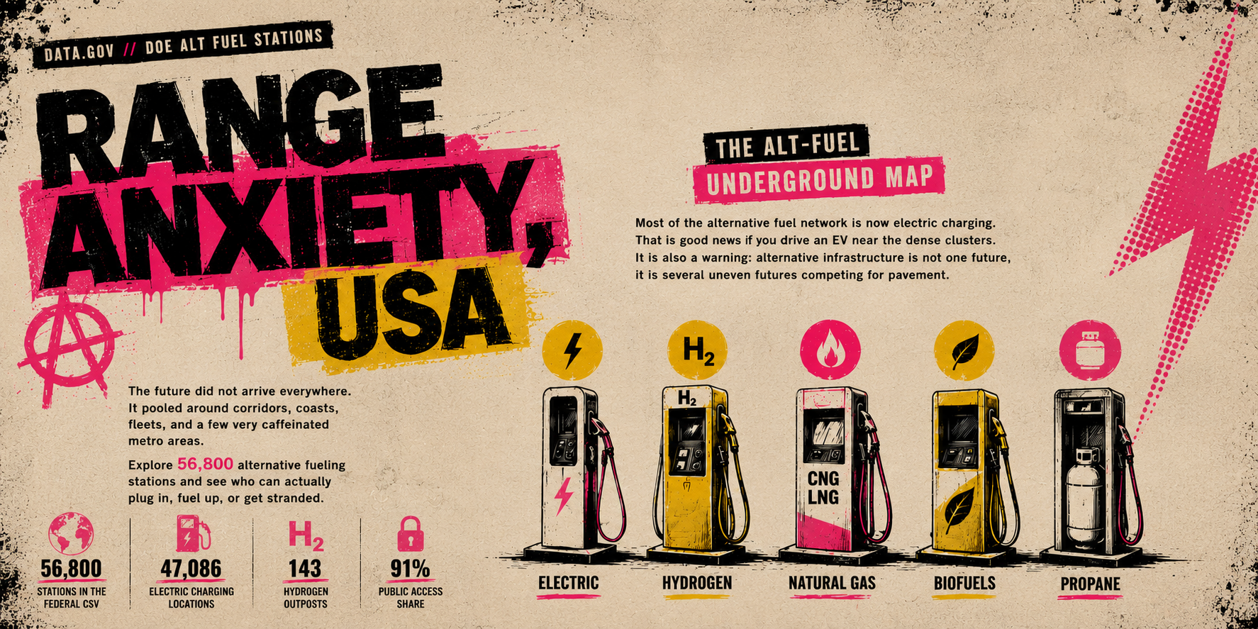
The source data comes from the Department of Energy Alternative Fueling Station Locations dataset, published through Data.gov. On paper, it is a CSV of fueling stations. In practice, it tells a much sharper story: the future of transportation infrastructure is not evenly distributed. Electric charging dominates the dataset, hydrogen barely exists as a practical national network, and public/private access shapes whether infrastructure is actually useful to ordinary people.
How I used AI to build it
I used Hermes, my AI coding agent, as a collaborator throughout the process. The workflow felt less like prompting a chatbot for a finished answer and more like directing a fast technical teammate. In-fact, most of this was created and deployed while I was sitting watching fireworks with my neighbors.
First, I asked Hermes to inspect the Week 3 theme and help identify an appropriate public dataset. It searched Data.gov, found the DOE Alternative Fueling Station Locations dataset, verified that the CSV was downloadable, inspected the fields, and helped frame the core civic story: alternative fuel infrastructure exists, but access is uneven, clustered, and politically revealing.
From there, I had Hermes build the first working version as a static web app. It processed the dataset into a lighter browser-friendly JavaScript data file, built the HTML/CSS/JS interface, and created visual summaries for fuel mix, state rankings, public access, and station counts. The initial direction was dashboard-like, but the competition theme called for something more rebellious.
We then iterated heavily. I gave Hermes visual and UX feedback in plain language. When the map was unstable on mobile, Hermes diagnosed the problem, reduced the data payload, replaced the tile-based map with a custom canvas map, and then added natural interactions: drag, pinch zoom, mouse wheel zoom, double-click zoom, and cluster splitting. The map now renders directly from coordinates without relying on external map tiles, which made it more reliable on mobile.
The visual style evolved through a series of critiques. I asked Hermes to move away from derivative dashboard design and toward a high-detail punk zine collage: distressed paper, screen-print textures, halftone grain, safety yellow, hot magenta, black ink, torn-paper panels, and bold flyer typography. Hermes rewrote the CSS, tested it locally, deployed it, and kept adjusting based on screenshots and feedback.
I also used Hermes for deployment and repository management. It published the app to Azure Blob Storage as a public static site, moved the final hosting path from /week3/ to /range-anxiety/, and pushed the completed source code to GitHub. Before pushing, it checked the repository for secrets and made sure credentials pulled from 1Password were only used at runtime and not committed.
What changed through iteration
The biggest lesson was that the AI was most useful when I treated it as an iterative builder, not a one-shot generator. I did not just ask for an app and accept the first result. I reviewed the hosted version, sent screenshots, pointed out mobile rendering problems, asked for better map behavior, pushed the visual identity harder, and made final content/layout edits.
Each round made the piece more specific:
- From a generic dashboard to a punk zine collage.
- From a heavy, fragile map to a custom canvas map.
- From static clusters to natural drag, zoom, and split interactions.
- From a Week 3 prototype path to a polished public /range-anxiety/ URL.
- From raw station counts to a civic argument about infrastructure access.
The final result
Range Anxiety, USA is a static, public, browser-based data story. It uses a federal dataset, but it does not present the data neutrally. It argues that infrastructure is a map of power: where the future is convenient, where it is gated, and where it is still mostly imaginary.
The project is also a record of the human-AI collaboration behind it. I supplied direction, taste, critique, and decisions. Hermes handled research, coding, debugging, visual implementation, deployment, and verification. The result is something I could not have produced this quickly alone, but also something that needed human steering at every step to become interesting.
Original source
Canonical Substack URL: https://kylesebestyen.substack.com/p/range-anxiety-usa.