Source note: Local copy of a Summer Into AI 2026 submission originally published on Substack. Screenshots, video, and audio found in the post body are mirrored locally when publicly accessible; profile and avatar images are intentionally not copied. Read the canonical post.
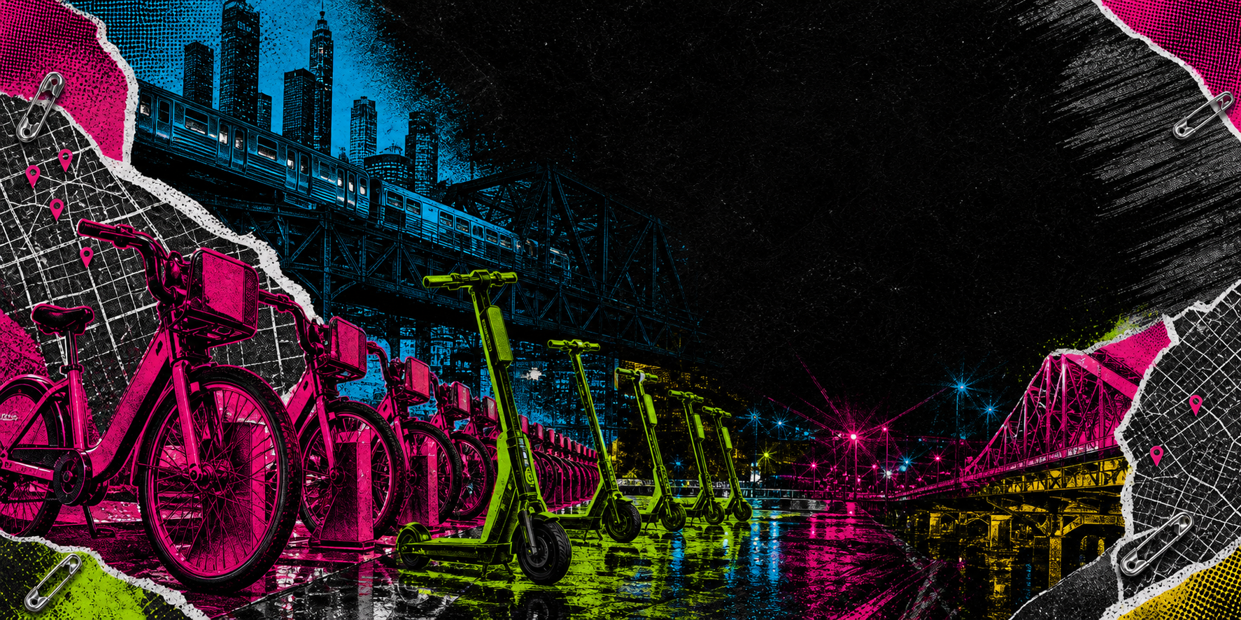
This is one of a few projects that’s making use of a new pipeline. This will be my first post on this setup, and I’ll cover some of what makes these apps tick. You’ll note the striking art style. My goal this week was to lean a bit more into the artistic aspects of the data. There’s a thought that maybe AI can’t produce interesting aesthetics-and I wanted to see just how far I could push that idea. It’s an idea that I began exploring in Wet Graffiti Cel.
What I learned in WGC is that you can push the image model into artistic motifs that are interesting, and distinct and discrete with code. In fact, the series of posts that’ll assemble together are all a mix of the codex image generation tool or direct openai image generations. I wanted to lean on a technology stack that I assumed most had access to, and nearly everyone has access to chatgpt in some way.
I’ll structure these set of posts with some screenclippings of the application itself, what I found works decently well and some areas I’m not completely thrilled with but, hey, it’s good enough to ship.
Let’s jump into the app, it’s visually something.
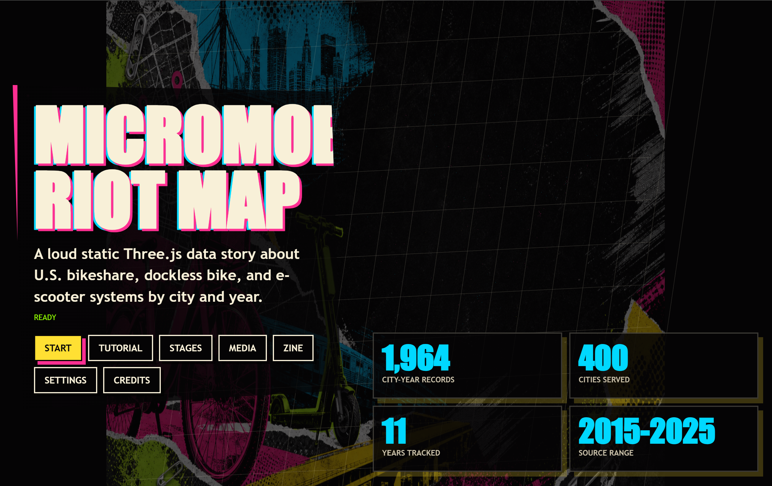
The main menu from the app is visually loud. It’s even got a handful of elements. I hear someone ask, “Does that say Zine?” Yes, yes it does. I even had a zine added to the experience based on the data. You can experience this data about bikes in a weird, punk-like way. Plus the art, it really is something.
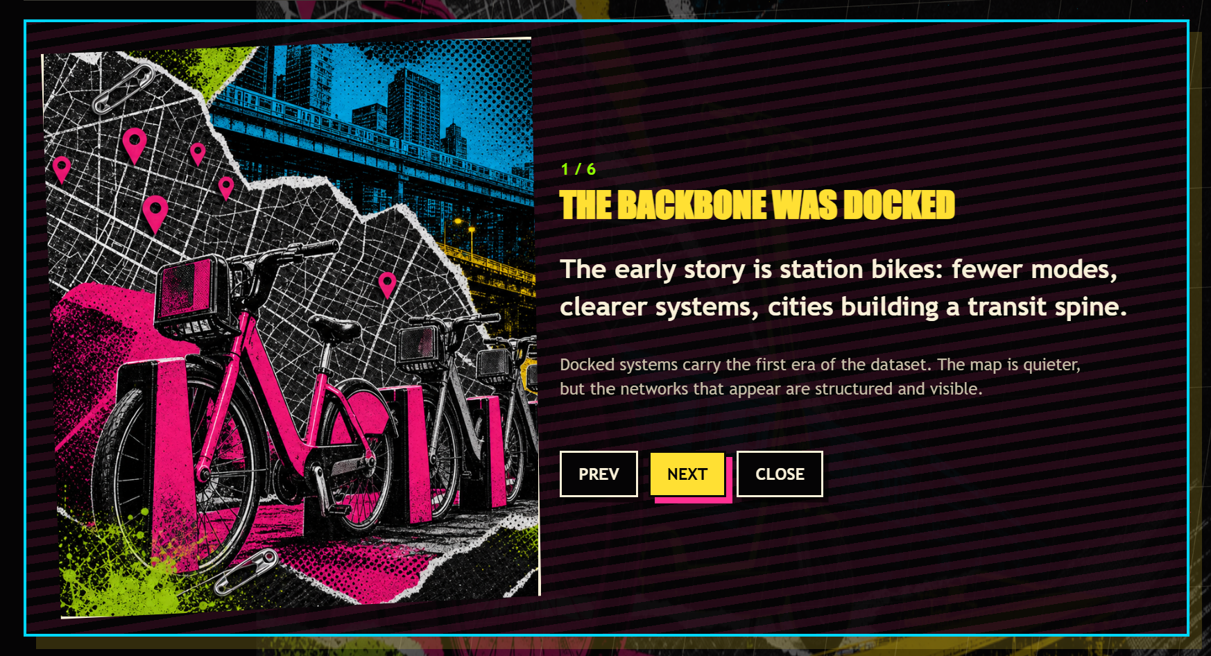
The main experience of the application-the tool that exposes the data? It’s a high contrast, visual display that assaults the senses. It has a lot of different components, and you can filter the data and view the scooter-bike-paperclipping that has emerged over time-and one more thing. The data itself even looks like the US when plotted. Pretty incredible.
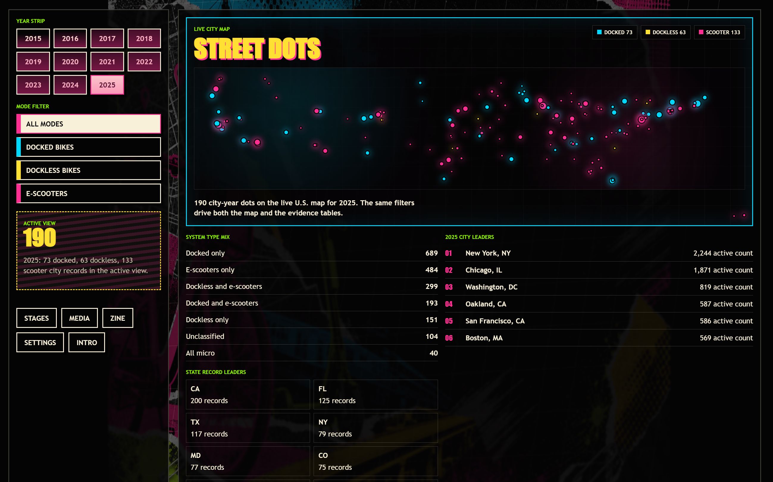
You can explore different scenarios, but there’s a bonus-I’m a big fan of the “one more thing” with these vibe-coded monstrosities.
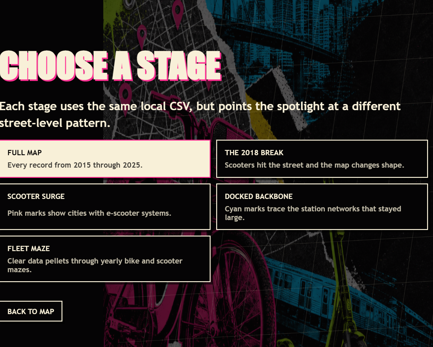
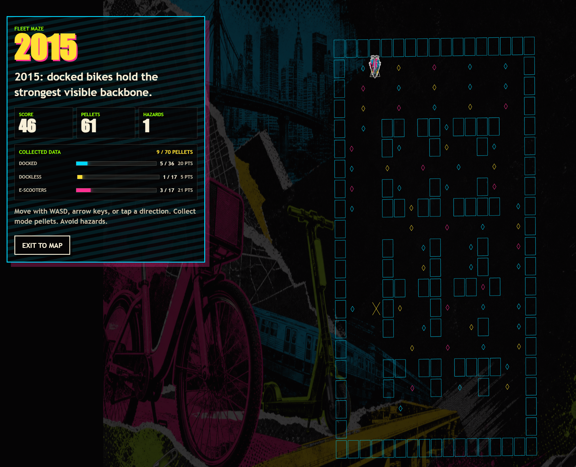
In this case, there’s a Pac-Man like clone in a rotating game-board where you collect the datasets to fill back out what happened in a given year. It’s a strange melody of real-world data pushed into an interactive experience. Does it make sense? Well… does it need to?
The Dataset
# Bikeshare and E-scooter Systems by Year and City Served

## Local file

- Dataset file: `bikeshare_escooter_systems_by_city_year.csv`
- Format: CSV
- Retrieved: 2026-07-01
- Size: 748,100 bytes, about 730.6 KB
- Shape: 1,964 data rows, 49 columns
- SHA-256: `a7e96edc7200944da59a070eb1d9a60e4abafdb807dffee8c529ed9e33955efd`

## Source

- Found at: https://catalog.data.gov/dataset/bikeshare-docked-and-dockless-and-e-scooter-systems-by-year-and-city-served
- Publisher: Bureau of Transportation Statistics
- Direct download used: https://data.transportation.gov/api/views/cqdc-cm7d/rows.csv?accessType=DOWNLOAD

## What it is

This dataset tracks bikeshare, dockless bikeshare, and e-scooter systems by city and year. Records include city, state, year, latitude, longitude, FIPS code, system type, operator names, launch and closure dates, system counts, and notes.
Ride your scooter to here
This was an interesting project-I learned a couple new tricks. And in fact, I’ll be publishing a few more posts of other submissions soon. You can try this loud visualization of bike data here.
Play it here: https://www.ericrhea.com/gamelab/projects/bikeshare/index.html
Learn more: https://www.ericrhea.com/gamelab/bikeshare.html
Original source
Canonical Substack URL: https://advisoryhour.substack.com/p/summer-into-ai-eric-week3-submission.